


DIY Standoff Frames

A while back, I fell in love with the modern, minimal look of standoff frames. Wanna know what I DIDN'T fall in love with? The price tag! Many of these styles can run $75-$100 for a single frame in the sizes I needed, since the structure is a little complicated and acrylic can be pricey.
I have tried many iterations of creating my own which resulted in tears, frustration, and a strained friendship with the guy who wields the drill in our house. I've discovered a middle ground, an affordable, easy hack that will tide you over until you can save up for the real thing!
Materials:
- Printed artwork/photos
- Acrylic sheet(s)
- Standoff hardware (similar to this)
- Spray paint (optional)
- Magnet discs (like these)
- Double sided clear tape
- Hot glue gun and sticks
- Drill or screwdriver
1. Print your pictures: I chose to download these images from Etsy for a whopping $6. It's actually a single image cut into two pieces, which worked well for our space! For the fastest turnaround, I normally print my downloadable art at Walgreens and use the "poster" size. They ALWAYS have coupons so be sure to check- but mine rounded out to a little over $8. I also did a similar project with some artwork I drew as a child, and have framed prints from thrift stores as well. This is not the frame for your Picasso, but works great as a large wall-filler.
2. Purchase acrylic sheets: I needed two for my project, and found exactly what I needed in the plexiglass aisle of Lowe's. In the past for larger images, I used the plastic insert from a poster frame I bought on sale at Walmart! Any size or thickness will work for this, just measure your space and your image and pick something a bit larger than your print.
3. Prep standoff hardware: The "hack" of this is that we are going to mimic the look of a standoff frame without the hard work. To do this, I spray painted cheap disc magnets the same size as my standoffs a metallic silver and it worked perfectly. I have also spray painted the standoffs themselves gold with the same result. The magnets I bought were gray/black so this was necessary, but I also experimented with other silver disc magnets, flat batteries, and some other lookalikes to get the look.
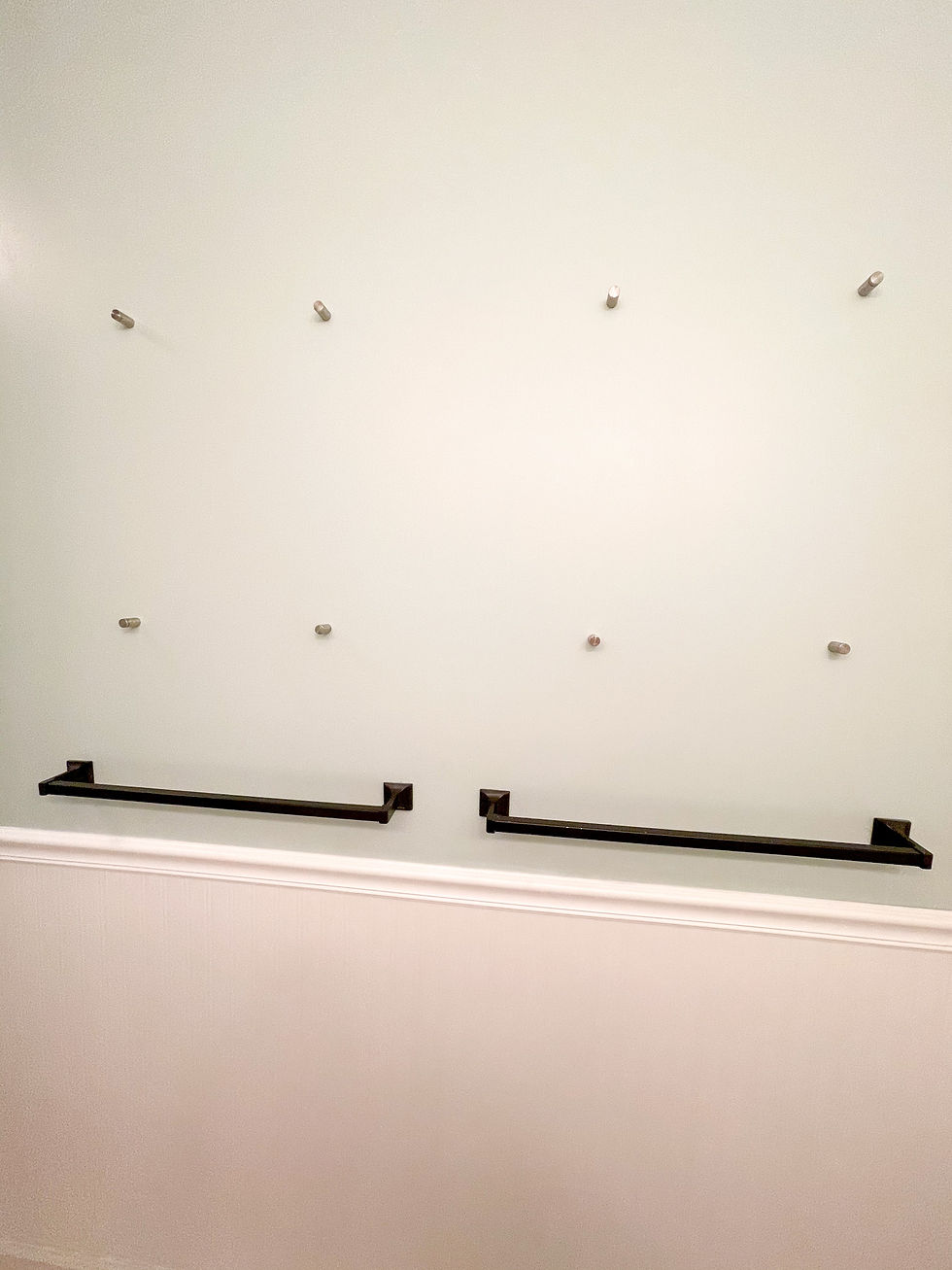
4. Screw standoffs into the wall completely: Each piece of standoff hardware has a base and a screw. In a normal scenario, the screw goes on top of the acrylic and screws into the base, sandwiching it between. However, drilling the holes is where I failed each time, so this is where the hack begins! Take the provided screws and drill them into the wall where you want them. You can use the acrylic as a measuring tool to place them, I used masking tape to get each corner positioned correctly. Then, screw the top piece into the base once it's fastened to the wall.
2. Measure and tape images to acrylic: For this step, I measured in each side but mostly eyeballed the placement that I wanted. I placed the image face up on one piece of acrylic, added double sided clear tape (as sparingly as possible so it will still hold the image in place) and then placed the second piece on top of it to make sure it was in the right position. For the second one, I did the same thing but placed the second print on top of the first so I knew they were in the identical spot. The harder you press on the tape, the more it disappears. Remember, it may not be perfect, but just chant to yourself how much money you're saving!
5. Apply hot glue to the standoff hardware: Apply a small blob of hot glue to the top of each standoff screw and quickly press your acrylic sheet to fasten it. I found that I had to do the top first, press, and then do the bottom so the hot glue wouldn't dry. Press firmly so that the acrylic is as flat as possible against the screws.
6. Apply magnets: Now that your art and acrylic are fastened to the wall, the magnets should stick easily on top of the acrylic. If there is any issue, you can always hot glue them on top to get the final look, but it would be a little harder to reposition or remove.
And voila! Your own mini-gallery, for about $25. While this isn't necessarily the most glamorous long-term solution, it works perfectly for our guest bathroom for the time being. I hope it inspires you to think outside the box with a project that has been stumping you!


iwinclub lúc đầu mình cũng hơi ngại bấm vào, sợ kiểu trang nhiều thứ quá rồi tìm gì cũng phải mò, mà ai dè mở ra lại thấy mọi thứ nằm đúng chỗ nên đầu óc đỡ phải “load” nhiều. Mình chỉ lướt qua thôi chứ không đào sâu nội dung, nhưng cái cách họ chia thông tin thành từng khối nhìn khá đã mắt, kéo xuống là thấy mỗi phần tách riêng ra rõ ràng. Mấy bảng thông tin cũng trình bày theo cột gọn, đọc liếc là nắm được ý. Menu đặt chỗ dễ thấy nên đổi qua lại cũng nhanh. Nói chung nhìn vài giây là biết mình đang ở mục nào. Mình thích nhất là cách…
https://hi88cz.com/ tối qua mình mở trên điện thoại để xem thử giao diện chạy ra sao, nói thật là ban đầu cũng hơi nghi ngờ vì mấy trang dạng này hay bày biện rối mắt. Nhưng lướt xuống một đoạn thì thấy họ chia nội dung thành từng mảng khá rõ ràng nên không bị cảm giác ngợp, nhìn cái là biết đang ở phần nào mà không cần đọc kỹ hết. Menu điều hướng đặt khá lộ, chuyển qua lại mượt và không phải kéo lên kéo xuống nhiều, nên dùng một tay vẫn ổn (màn hình nhỏ mà vậy là được rồi). Mình để ý phần thể thao có kiểu bảng kèo cập nhật liên tục nên nhìn…
xoilac5 tv hôm nay mình mở trên điện thoại để xem có đúng là đỡ phải lục lọi khi lịch đá dồn dập không; vào cái là thấy phần lịch với mấy tiêu đề trận đặt khá lộ nên tìm trận đang diễn ra nhanh hơn mình tưởng, kiểu não chưa kịp tỉnh mà tay vẫn bấm ra được đúng chỗ; xem thử một lúc thì đường truyền giữ ổn, hình với tiếng rõ ràng, không gặp cảnh đang hay lại đứng hình rồi phải làm động tác tắt mở như tập thể dục ngón tay; mình cũng thích kiểu họ làm trang đơn giản, ít màu mè nên lướt qua lướt lại không bị lạc, nhất là mấy khối…
O8 dạo này thấy nhiều người nhắc nên mình cũng ghé thử cho biết, kiểu vào xem giao diện với cách họ trình bày thông tin thôi chứ không chơi gì. Lướt một vòng thấy trang làm khá thoáng, chữ không bị dồn, mấy khối nội dung tách ra rõ nên kéo xuống không bị “ngợp”. Có đoạn họ nhắc số lượt đánh giá 5 sao khá nhiều, nhưng cách đặt con số và phần mô tả nhìn gọn, không kiểu nhồi nhét. Mình cũng thích cái menu để dễ thấy, bấm qua lại mấy mục nhanh, không phải mò lâu. Nói chung cảm giác như họ sắp xếp theo từng box ngay ngắn nên nhìn phát biết đâu là…
https://88xbet.agency/ có đáng mở ra nghía thử không? Mình tự trả lời luôn là cũng đáng, ít nhất để xem họ trình bày thông tin kiểu gì cho dễ đọc. Mình hay hơi cảnh giác với mấy trang cá cược, nên vào là mình chỉ soi bố cục với cách họ nói về độ uy tín/bảo mật thôi, và thấy phần giới thiệu 8XBET viết tương đối gọn, lướt nhanh vẫn bắt được ý chính chứ không kéo dài lê thê. Có một đoạn nhắc Teddy Sheringham như điểm nhấn hình ảnh, đặt riêng thành khối nên nhìn qua là thấy ngay, kiểu không phải cuộn mãi mới gặp, nên mình thấy cách họ sắp xếp cũng có ý tứ.…